Invisible problems
In today’s interconnected world, it is not uncommon for a designer to engage in a project that involves a foreign script. These may range from entire sentences to single words, all requiring seamless integration into your design. How should you best approach this situation? Is it sufficient to rely solely on your personal experience and intuitive judgement when working with text in an “unfamiliar script”?
In the upcoming months, I will delve into a series of articles discussing “invisible problems” in the domain of multi-script typography, with a specific focus on the incorporation of Japanese text (some considerations may also apply to CJK) into your design projects. So, what are these “invisible problems” I am referring to? To provide some context, allow me to share a bit about my background.
Moving away from Japanese typography
I have been living in Germany for over a decade now, co-managing a type design studio, Just Another Foundry, with my partner, Tim Ahrens. Before that, I spent six years in London, working as a graphic designer and typographer, primarily focused on book typography. Surprisingly, even though I am Japanese and my native language is Japanese, I predominantly work with Latin characters in my daily tasks. The reason for this is that 20 years ago I consciously shifted away from Japanese typography.
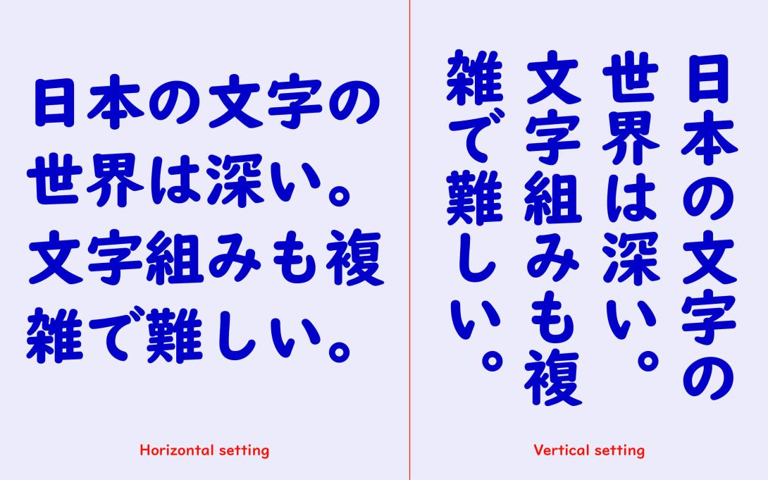
While I was studying communication design in Tokyo, I developed a keen interest in typography. However, I encountered some challenges with the complex Japanese writing system. The Japanese written language is intricate and diverse, featuring three distinct scripts (Hiragana, Katakana, and Kanji) and two writing directions (left to right and top to bottom).
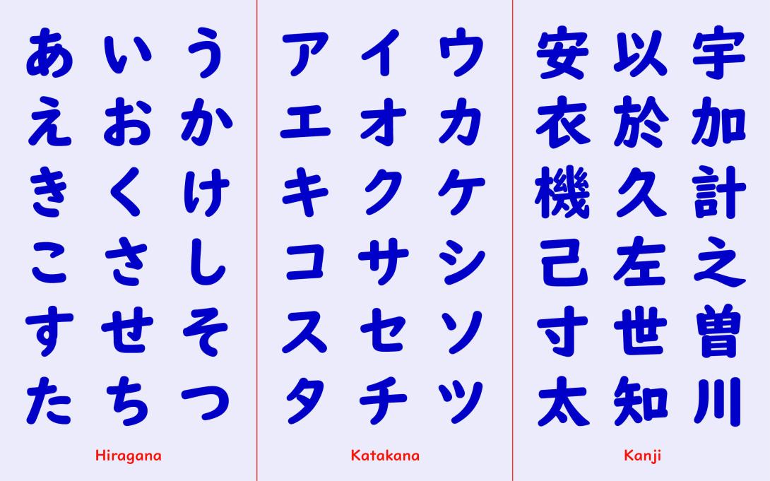
Consequently, even a simple word like “hello” in Japanese can be expressed in six different variations, each carrying its own nuanced meaning.
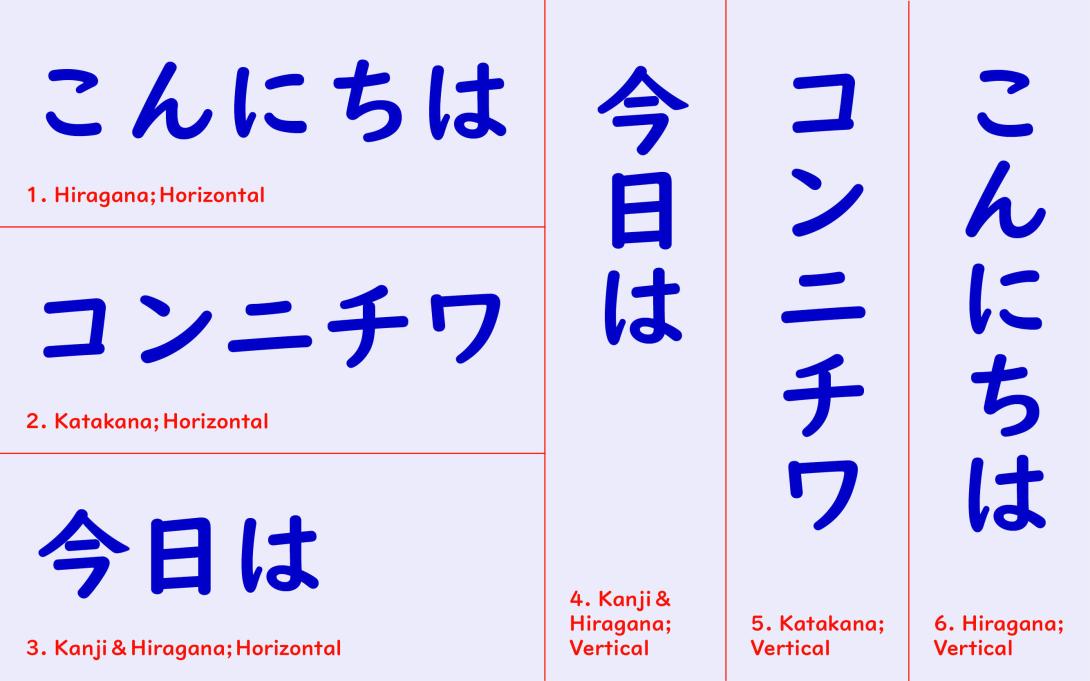
For example, vertical text often conveys tradition and formality, while hiragana imparts warmth and friendliness, among other subtleties. This means that when we write or design text, we encounter a multitude of choices. While some might view having numerous options as an advantage, I, however, did not share that perspective at the time. In my view, much of Japanese typographic work appeared excessively complex and overly intense. For those inclined towards a more minimalist and straightforward design and typography, the abundance of choices could be quite overwhelming.
This is why I chose to delve into Latin typography, as it appeared to be the polar opposite of Japanese typography – characterised by its simplicity and systematic structure.
As a young designer, I relocated to England and dedicated three years to studying typography. Following my studies, I pursued a career as a designer in London for several years.
Typography is not an image
During my time in England, I came to an important realization: 'typography is not an image'. This may seem self-evident when you are considering your native language – when you encounter a text written in your own language, it is almost impossible not to read it. The meaning immediately registers in your mind, even before you consciously start reading. However, it can be surprisingly easy to neglect this fundamental principle when integrating a foreign script into your design.
After spending several years in England, where I immersed myself in the language, I began to realize that during my time in Japan, I viewed the Latin alphabet more as a decorative element. It appeared to me as a symbol, almost like an icon, representing Western culture or modernity, rather than something I actively engaged with through reading.
In fact, when I return to Japan nowadays, I cannot help but notice the peculiar use of the Latin alphabet in various contexts. Odd shop signs, mysterious public signs, publications with poorly typeset text, and so on.
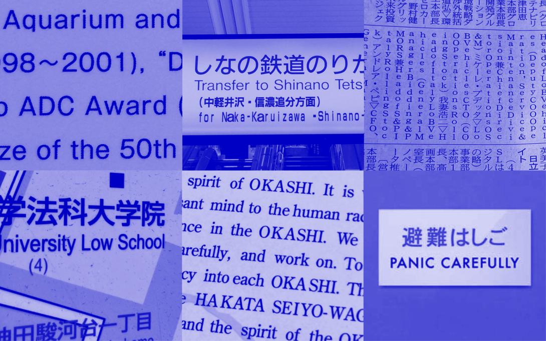
While some of these instances are almost amusing, many are simply incorrect and absurd. Conversely, as a Japanese individual residing in Europe, I frequently encounter puzzling uses of Asian scripts within Western culture. Bizarre packaging designs, hideous letterings marred by misspellings, publications with substandard or outright incorrect typesetting, and more.
Why are these mistakes unnoticed by the locals? Because, to them, a foreign script in a design is perceived as nothing more than an image. These issues remain hidden from their notice.
Making “invisible problems” visible
Initially, it might seem like Japanese people using Latin characters and Westerners using Japanese characters are making entirely different types of mistakes. But when you take a closer look at these errors, you will start to notice some shared patterns. Apart from language-related concerns like spelling errors and mistranslations, numerous mistakes arise when individuals attempt to superimpose the conventions or aesthetics of their native typography onto a foreign script. Furthermore, many issues go unnoticed due to the absence of equivalent concepts in their own native typography. The real challenge lies in the fact that even highly skilled designers may overlook these issues if they lack familiarity with the specific language or script.
So, how can we render these “invisible problems” visible? This led me to the idea of discussing mistakes made by both parties, with each article dedicated to a particular theme like “font,” “calligraphy/handwriting,” “alignment,” “spacing,” and so forth. I believe that by closely examining the mistakes of our counterparts, it becomes easier to recognize our own shortcomings. Furthermore, exploring typographic rules of other scripts is fascinating. It provides a perspective of “comparisons,” aiding in a deeper understanding of one's own culture and typography too.
Special thanks to Mari Tashiro for generously sharing a few pictures.